Concept:
This project was part of an annual event held at Syracuse University's S.I. Newhouse School of Public Communications. The project, called Pixels and Print, takes place over a span of 48 hours during which students completely redesign the branding and website of a chosen nonprofit organization. The project gave me and my classmates experience designing in a group setting and with clients.
The Baldwin Fund is a cancer fund based in Central New York. They presented us with the goal of raising $5 million dollars to put towards the establishment of a NCI Designated Cancer Institute in Syracuse, New York. The institute would help millions of New Yorkers and people of the surrounding area who need tests and treatment.
Roles: Team Lead, Lead Designer
Tools used: Figma, Adobe Photoshop, Adobe Illustrator, Slack
My role: Student Team Leader
We students are divided into different teams that handle different sections of the rebrand. This year there was a print team, UI/UX team, immersive team, and social media team. I was a member of the UI/UX team and chosen to be a UI/UX student team leader.
I was responsible for team coordination and leadership, motivating the team members, facilitating collaboration, and working on perfecting the design as a whole. I set clear goals and objectives for the team, ensuring everyone understood their roles and responsibilities in the short amount of time we had. I also organized team meetings, brainstorming sessions, and design critiques which encouraged innovation and collaboration.
In addition to coordinating the team, I also helped new designers understand how to apply tools and techniques to their particular tasks. As Team Leader I learned that organization of the group can be achieved through leadership of the individual. When each member of the group knows their task and is made capable of achieving it, the whole group becomes more functional and productive.
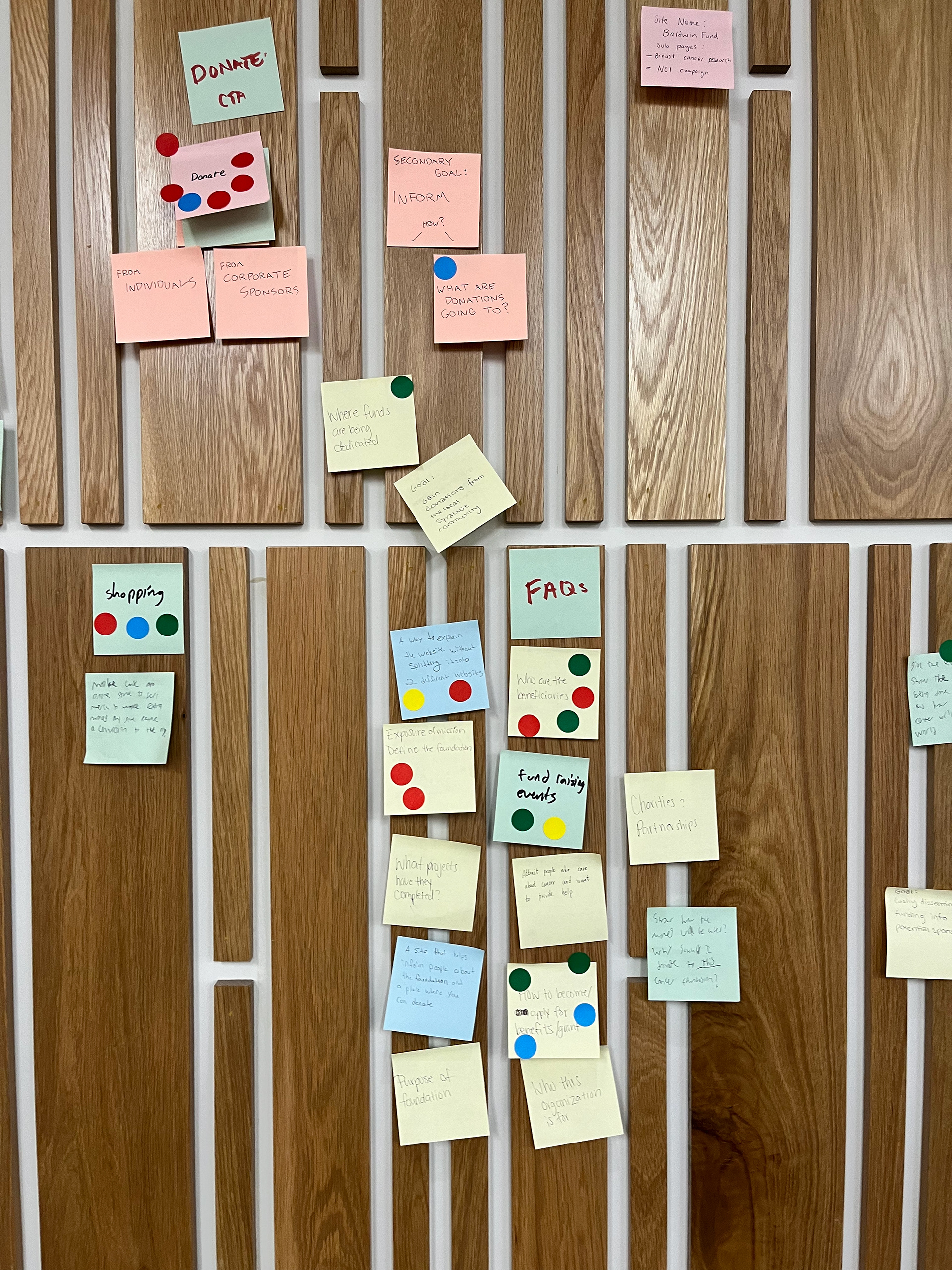
A section of the brainstorming wall we used to iron out the site architecture.
Our process
Because this redesign was a complete overhaul of the previous website, we took a completely fresh approach to its architecture and flow. We started by using the old website and thinking about what worked and didn't work.
In addition to this, we also brainstormed things the website should include/answer. This included writing down questions users would ask, pages they would want to find, etc.
After we (literally) threw all these ideas against the wall, we had a discussion and grouped them into categories. From there we used stickers to vote which of these items is most important/necessary to its respective category. Some sticky notes got a lot of votes and some got none.
These categories created the framework of the website and made the job much easier moving forward.
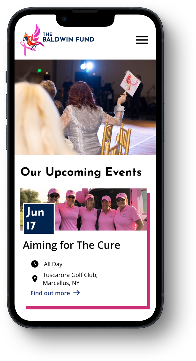
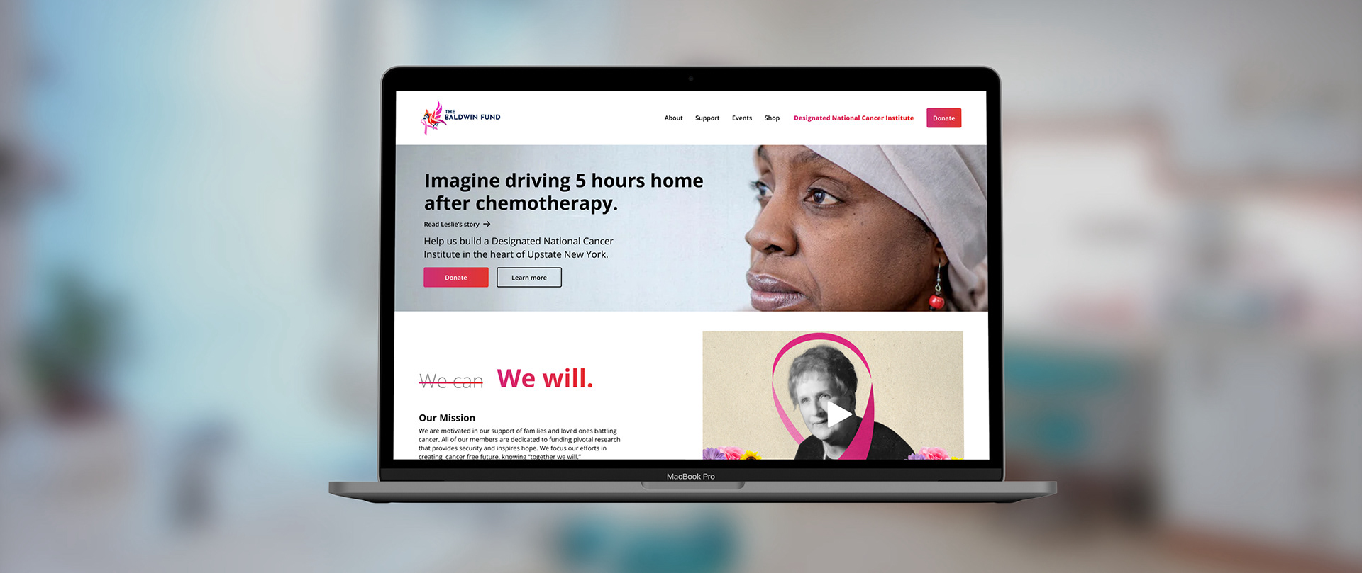
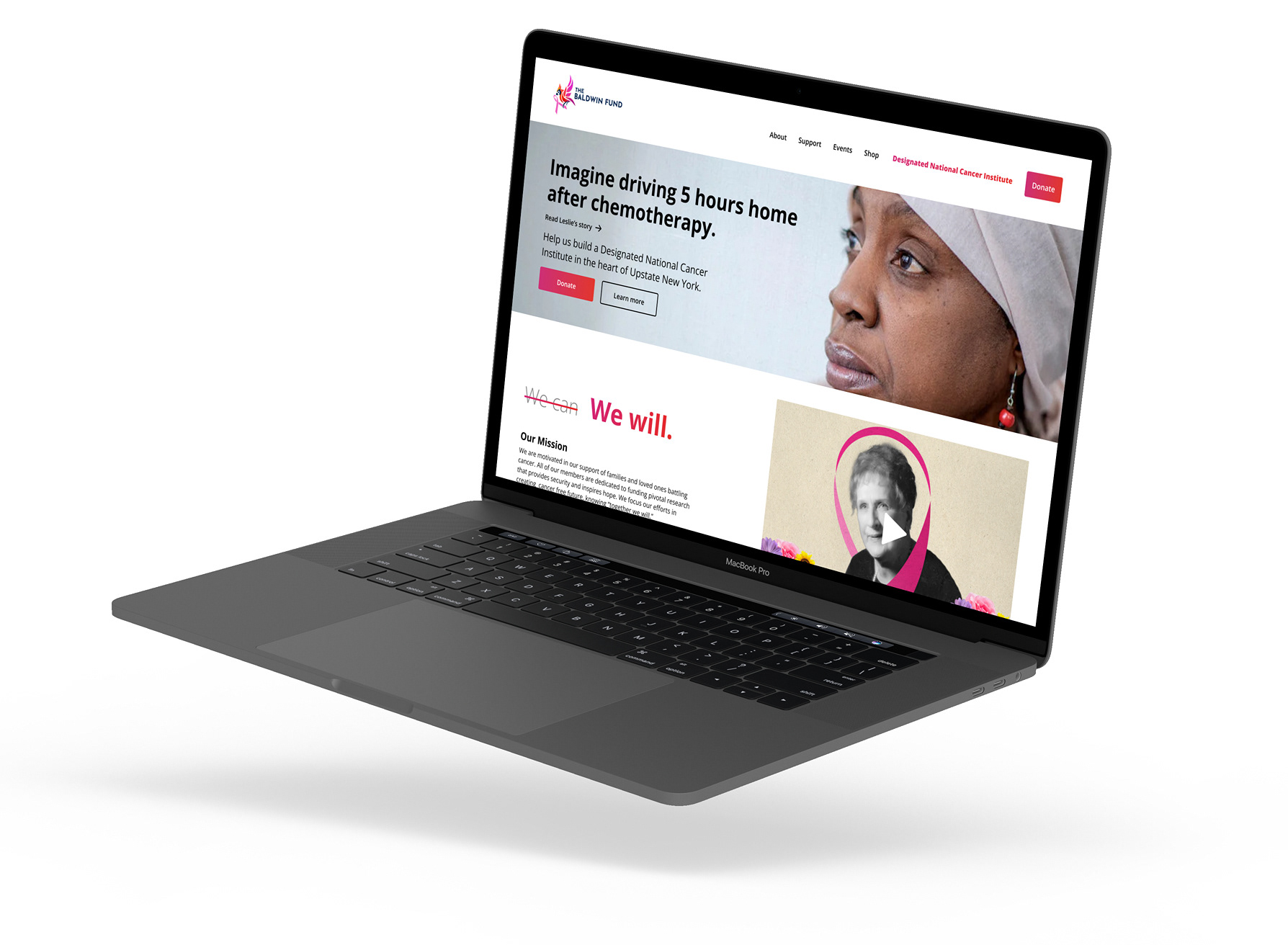
Homepage
The homepage of this website, like most, had to illustrate the mission and goals of the organization. Our job as the UI/UX team was to guide people who entered the website to donate to the fund. To do this, we used this valuable homepage real estate to do three things: engage, educate, and call to action.
The main banner is the what brings users into the experience. We wanted to show the perspective of many local cancer patients and illustrate the impact an NCI can have. Putting the user in another person's shoes engages their pathos and makes our mission relatable.
Underneath the banner is the fund's mission statement paired with an illustrative video of the fund's origin. This is the informative section of the homepage real estate. It both explains our purpose and establishes credibility.
The final piece of this sequence is the call to action. We included two primary, high contrast buttons that offer seamless access to the donations page.
Because this entire project was to be completed in 2 days, the homepage was the only screen that was mocked up in both desktop and mobile format. The rest were designed in just mobile.
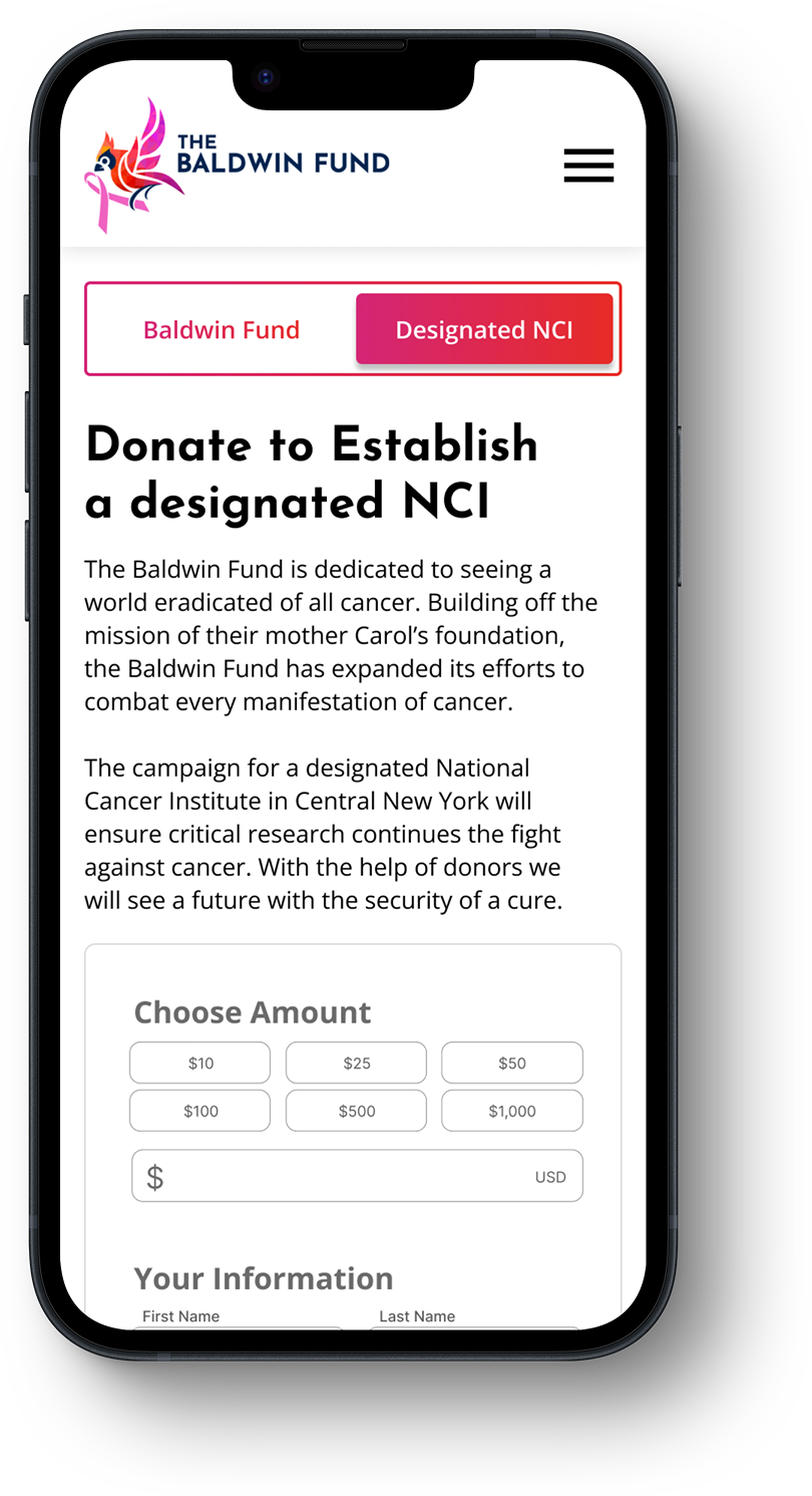
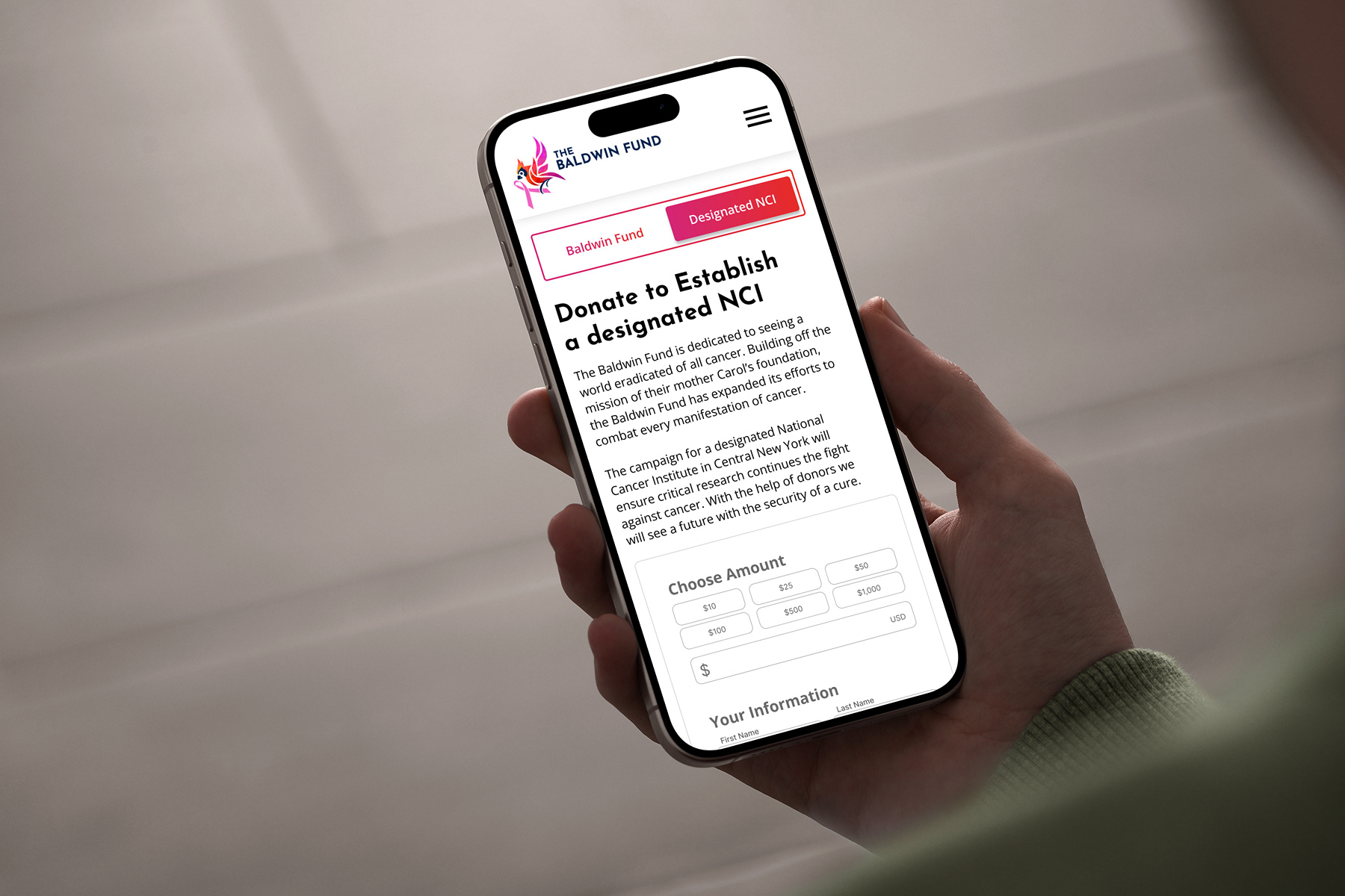
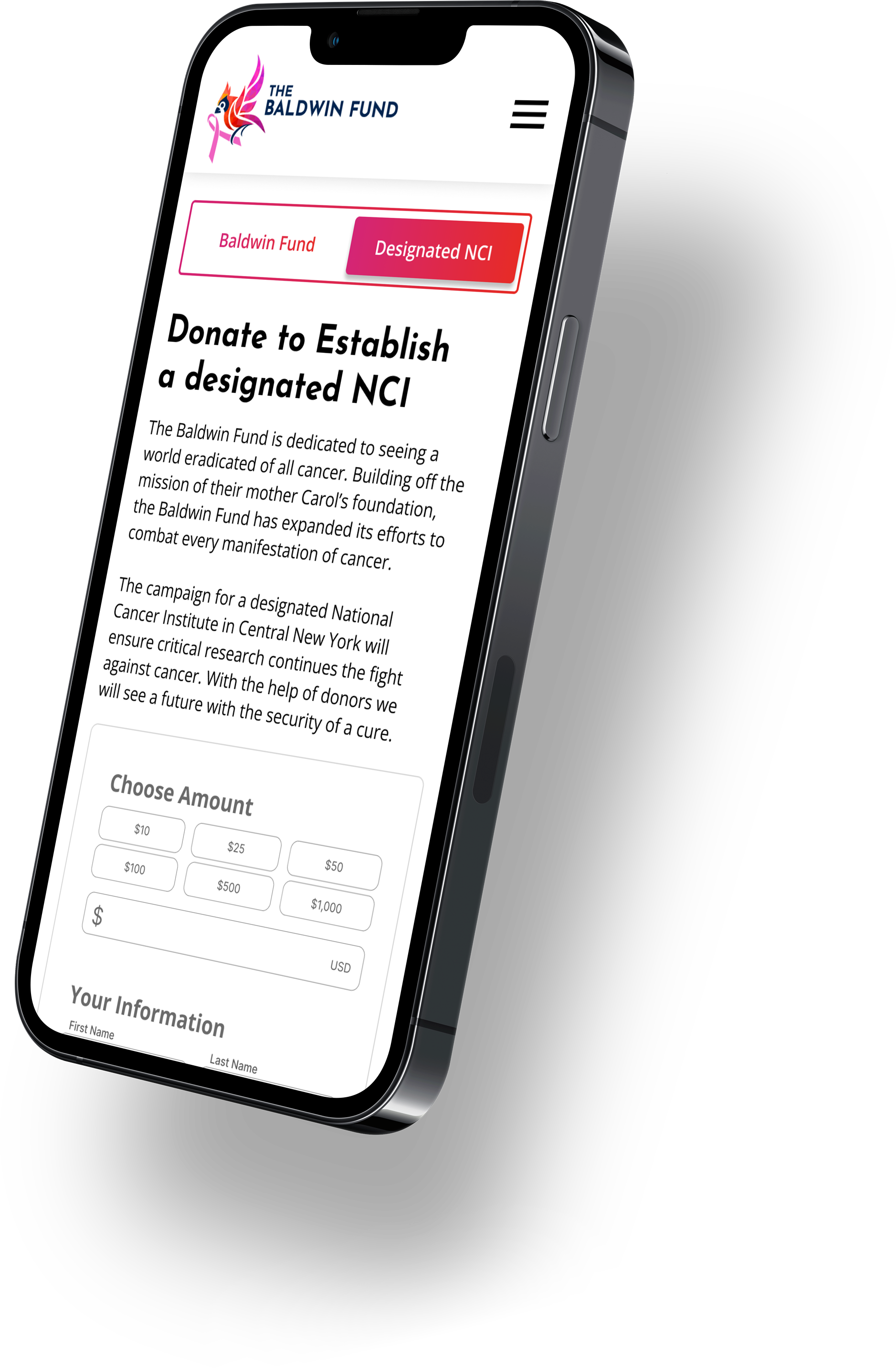
Donation page
Another challenge the UI/UX team had to overcome was the issue of two seperate donation options. The Baldwin Fund has two donation banks. One, the Baldwin Fund itself, goes towards breast cancer research and treatment. The other is the organizations current project, the funding of a Designated National Cancer Institute.
The problem we faced was separating these two options while making clear the differentiation of each. We did not want users to click donate and then become confused, overwhelmed, or turned away by having to choose between where to donate.
To overcome this challenge I had the idea to include an interactive sliding bar at the top of the donations page that allows the user to navigate quickly between the two donation options. Each of the two tabs briefly explains what each respective donation location would go towards and the difference between them.
Mobile pages