Concept
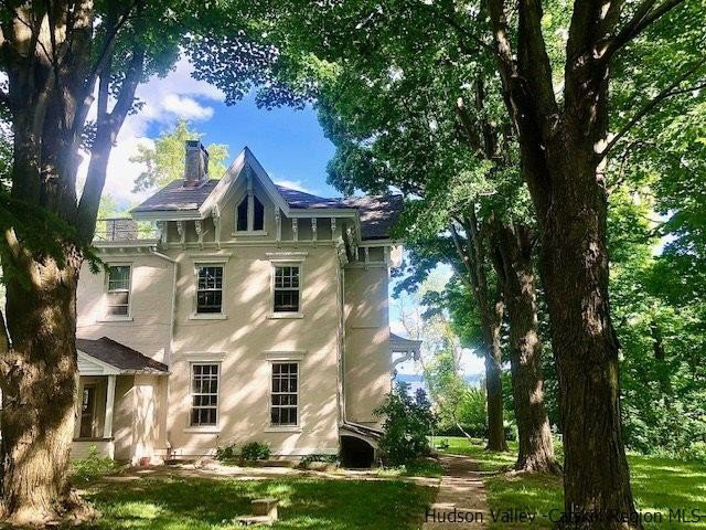
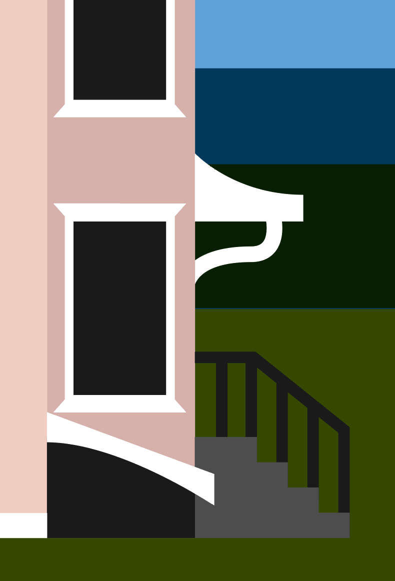
The geometric style I used throughout this series of posters was inspired simply by the shapes of each of the subjects depicted. I was also firstly inspired by minimal sailing posters from the mid twentieth century. Designing each poster, I would find an image of the subject, such as the house or the school buildings, and identify key shapes that made up the structure. Changes in depth helped me create a palette that complimented the structure.
Roles: Typographer, Illustrator, Researcher
Tools used: Adobe Illustrator
The two posters on the left and right were passion projects designed as gifts for friends and family. The poster in the center was made to raise funds for the Syracuse University Club Sailing Team.
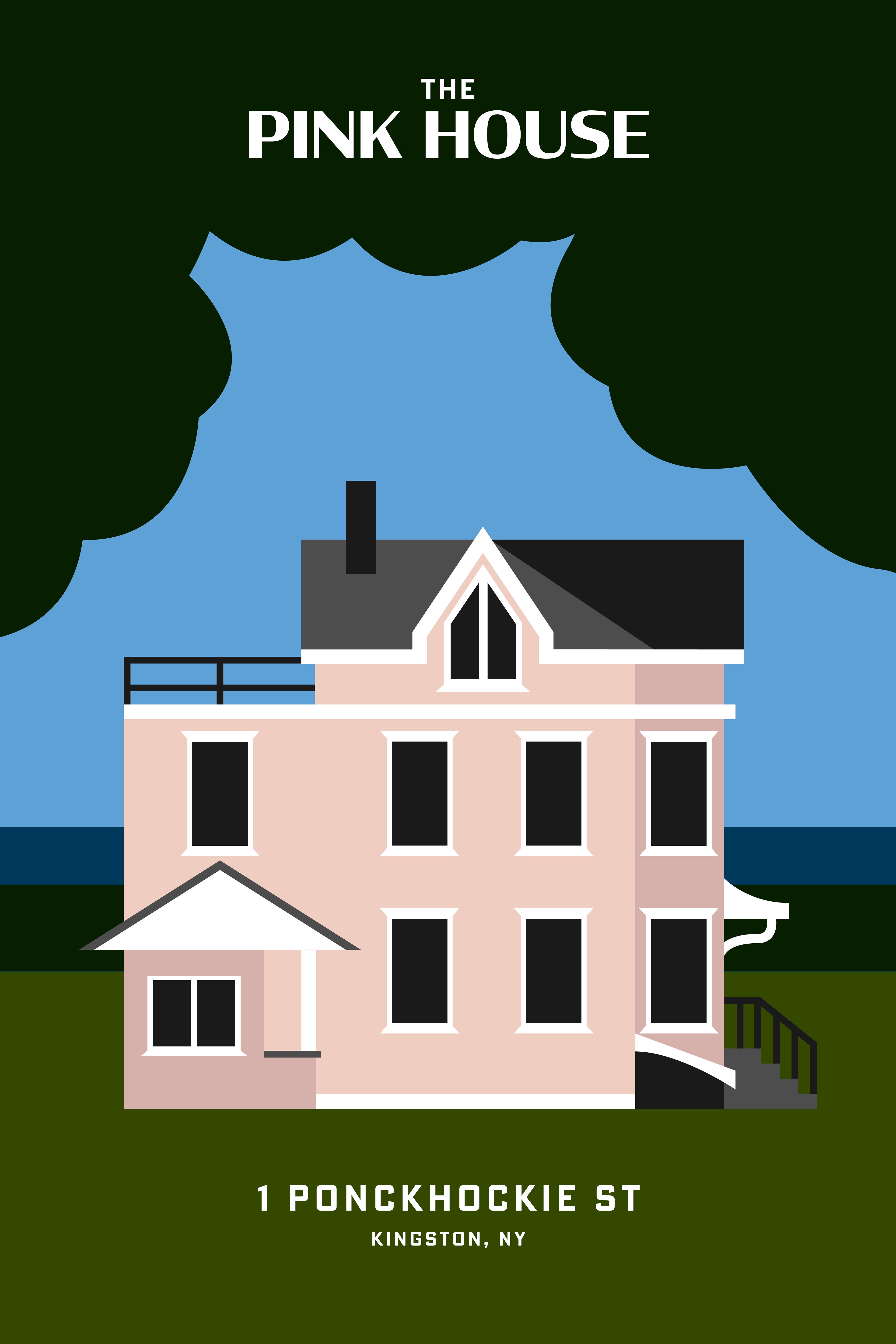
The Pink House
The Pink House poster was the first architectural poster I have ever designed. I was inspired by the Instagram account @houselogos, which simplifies the architecture of houses. By reducing the structural shapes of each house to simple lines, the designer creates a very unique and identifiable logo for different houses. With these qualities in mind I immortalized my late childhood home and created a poster for my parents.
The Pink House poster was the first architectural poster I have ever designed. I was inspired by the Instagram account @houselogos, which simplifies the architecture of houses. By reducing the structural shapes of each house to simple lines, the designer creates a very unique and identifiable logo for different houses. With these qualities in mind I immortalized my late childhood home and created a poster for my parents.
The Dahl Residence
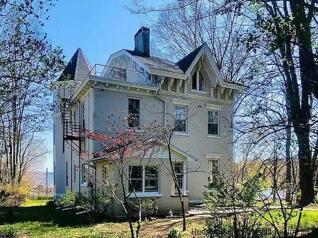
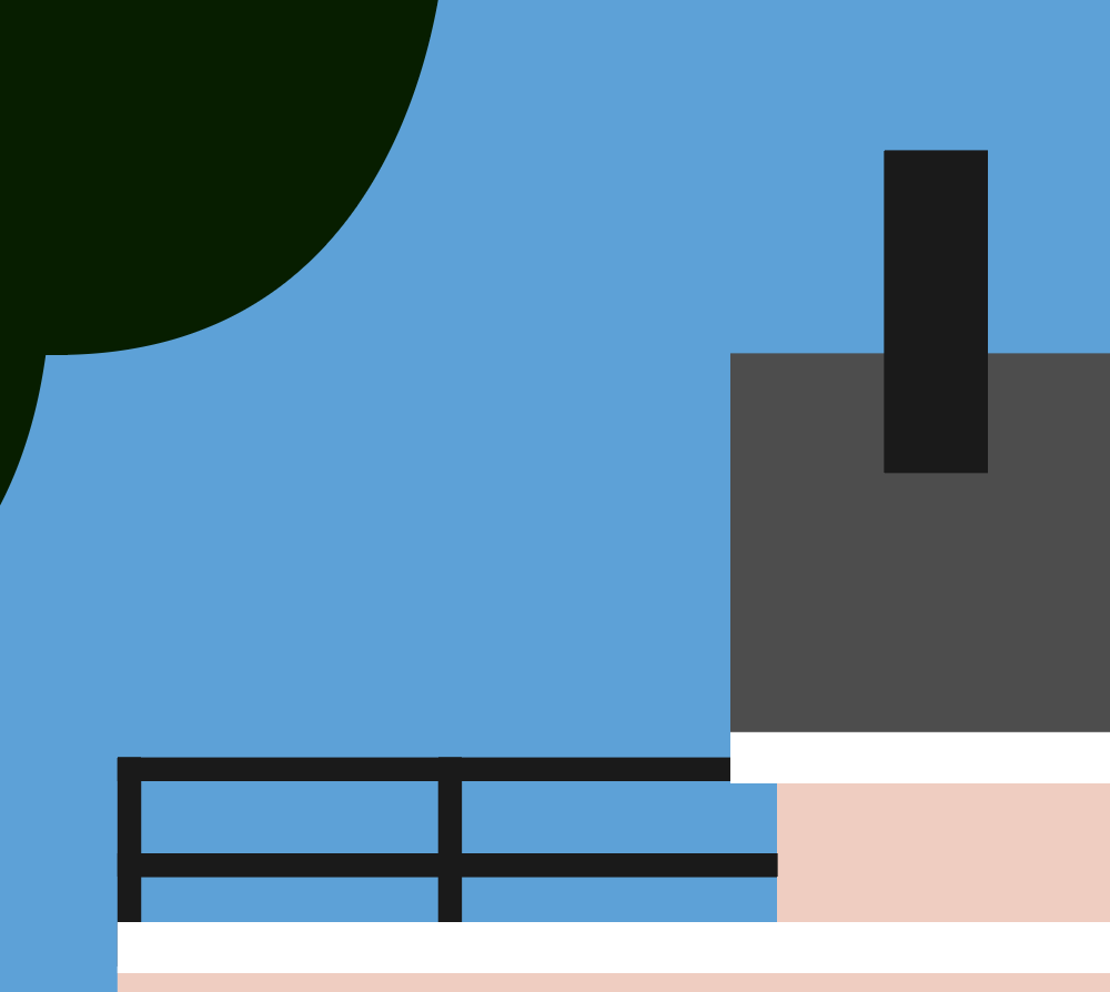
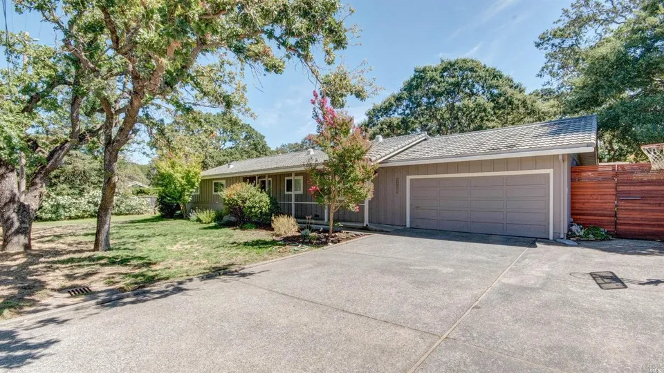
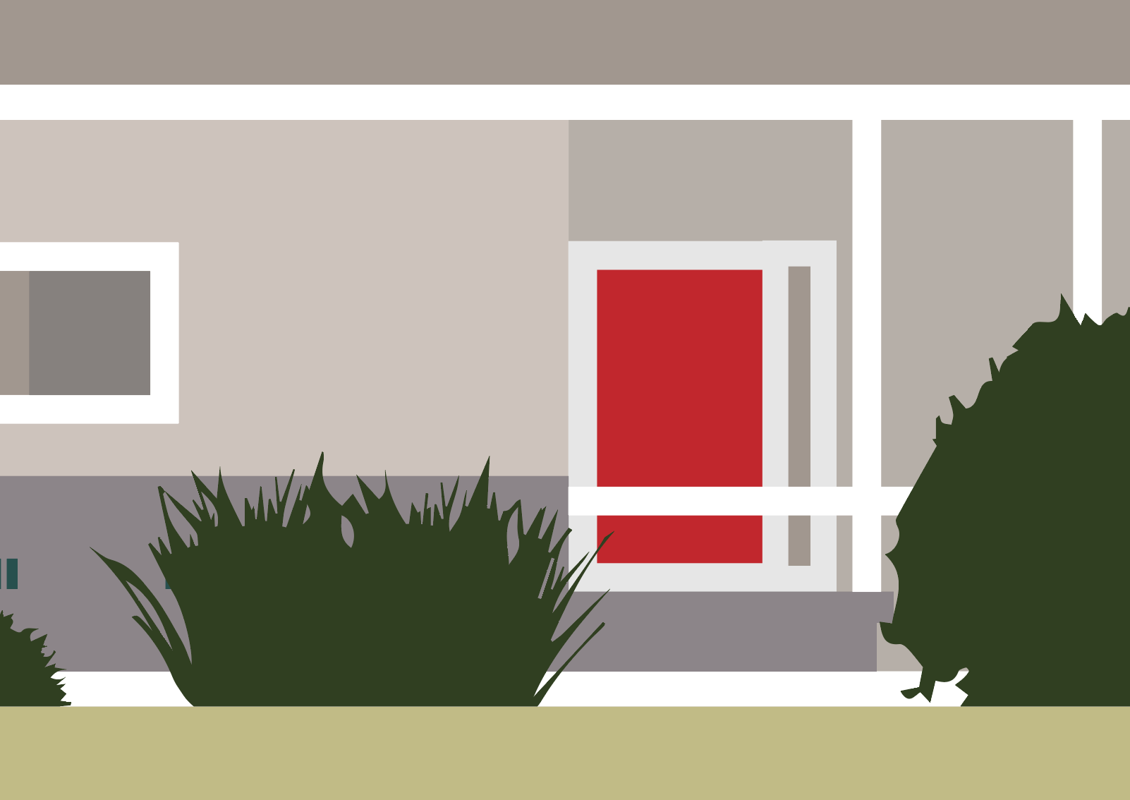
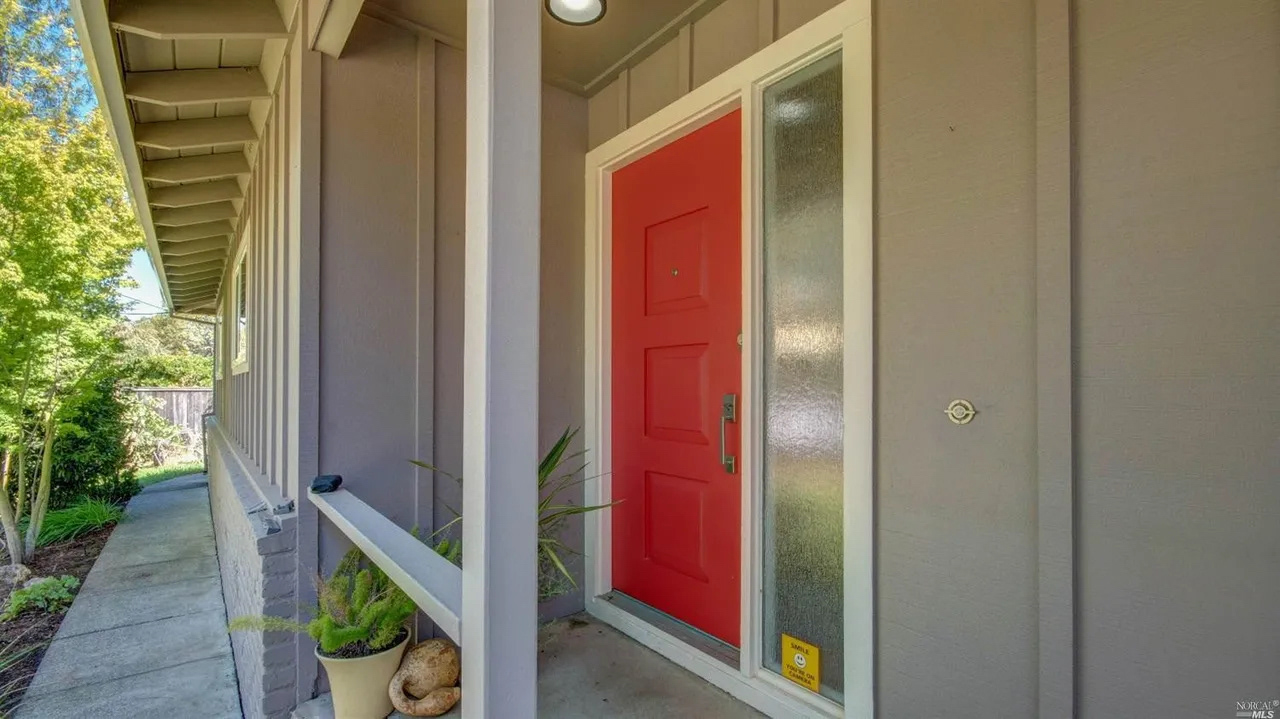
As the place my girlfriend grew up, the Dahl Residence is also a late childhood home. The main challenge I had with this design, however, is that I had never lived in this home, and I had seen it just once. Using real estate websites I was able to get a sense for the building's shapes and main features and recreate it accurately enough to impress my girlfriend.
Syracuse Sailing Team
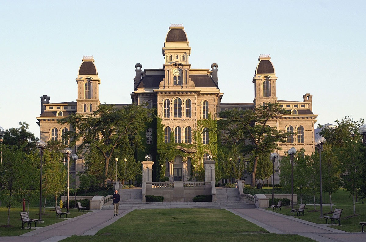
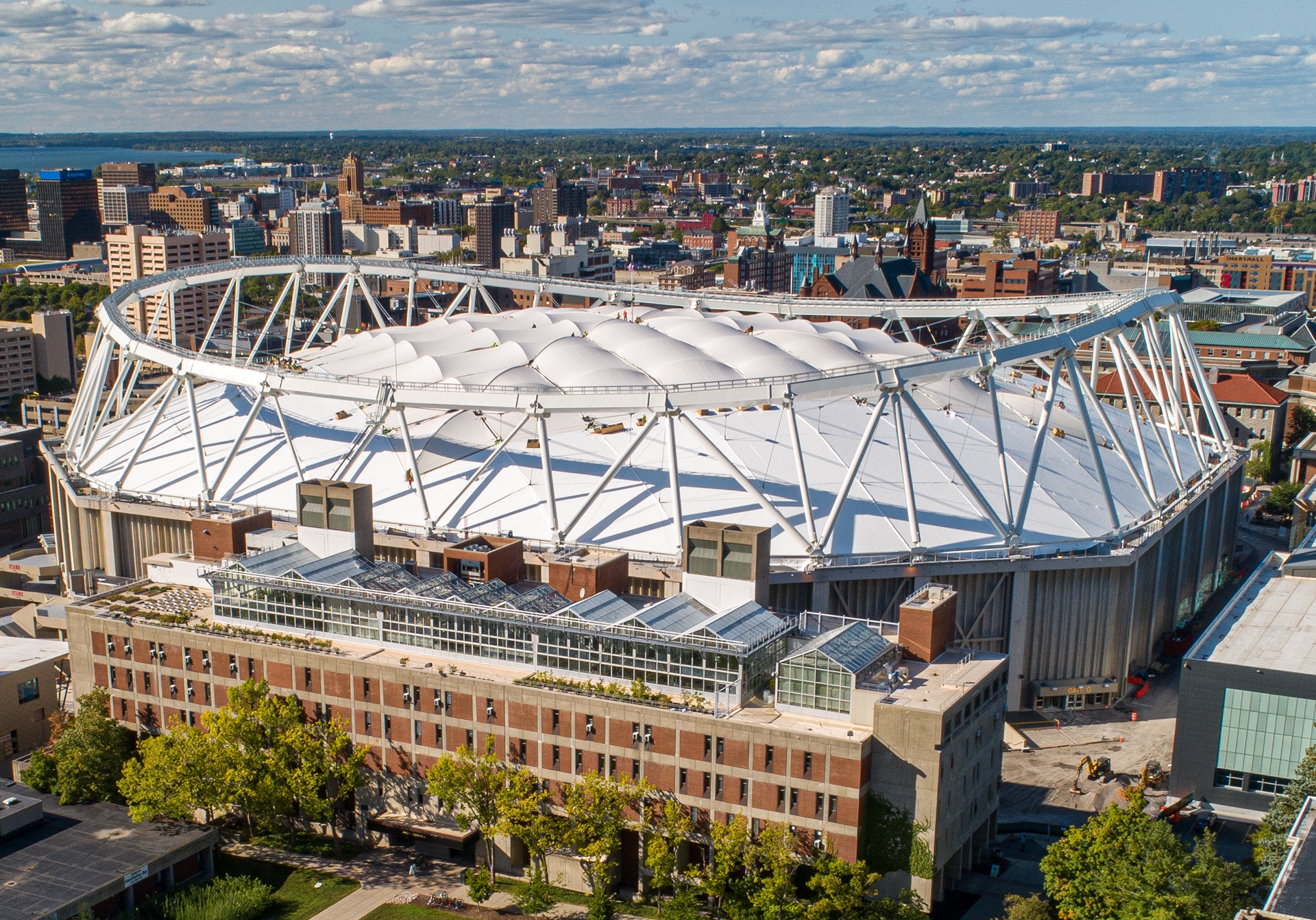
This was the very first poster of this style that I made. It was designed for the Syracuse Sailing Team which I was a member of and was sold as a poster and on the back of a tee shirt as part of their annual merchandise fundraiser. The poster frames sailing in the context of the university's most iconic structures.
This was the very first poster of this style that I made. It was designed for the Syracuse Sailing Team which I was a member of and was sold as a poster and on the back of a tee shirt as part of their annual merchandise fundraiser. The poster frames sailing in the context of the university's most iconic structures.



While each of these posters were made individually for separate purposes, they are all meant to embody a cohesive style.
