The Baldwin Fund
Concept
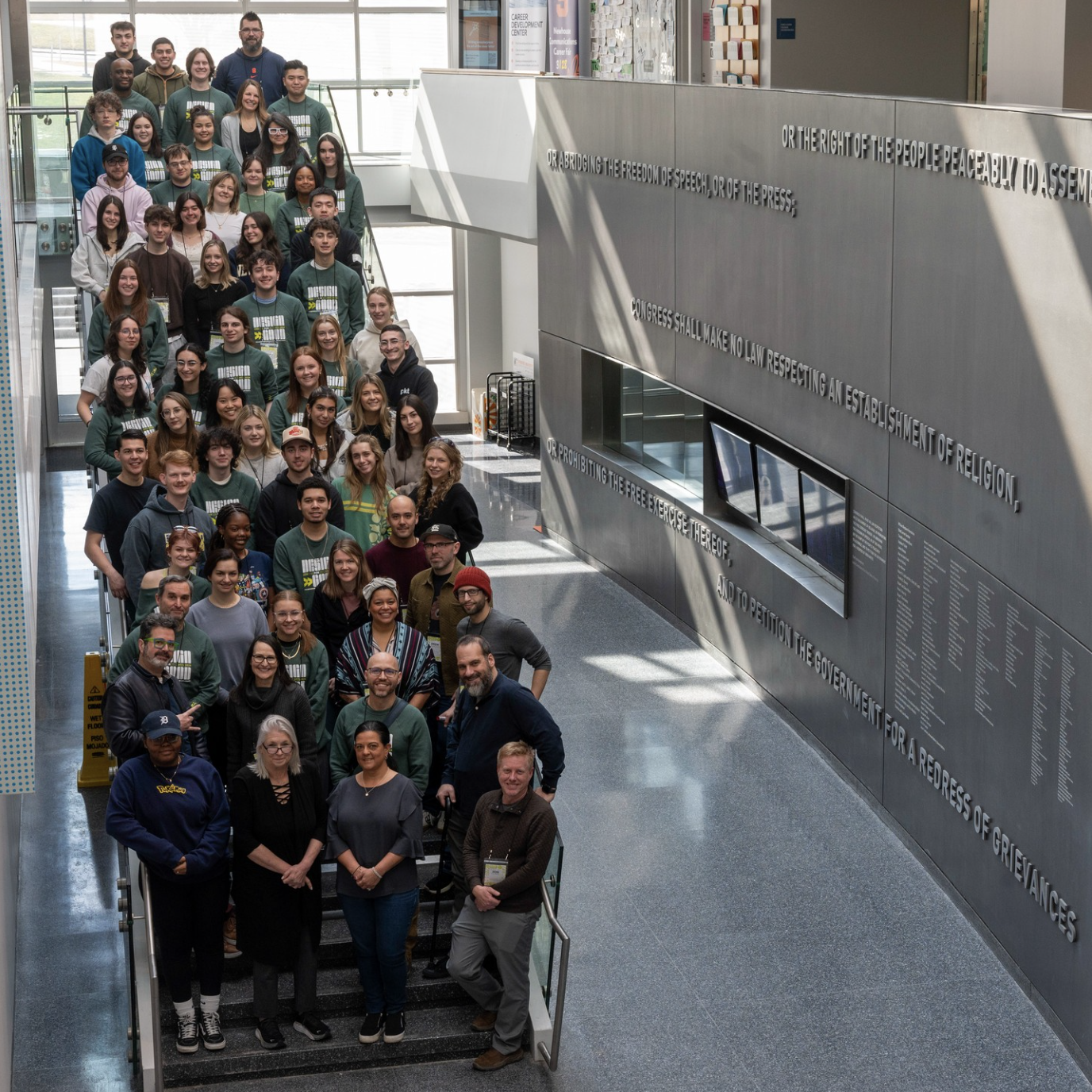
This project was part of an annual event held at Syracuse University called Pixels and Print. The workshop takes place over the span of 48 hours during which students completely redesign the visual identity of a chosen nonprofit organization.
The Baldwin Fund is a cancer fund based in Central New York. We were presented with the goal of raising $5 million dollars to put towards the establishment of an NCI Designated Cancer Center in Syracuse, New York. The institute would help millions of New Yorkers and people in the surrounding areas who need tests and treatment.
My role
Leading the UI/UX Team.
Students were divided into specialized teams (UI/UX, immersive, print, and social media) to handle different sections of the rebrand. I was selected as the UI/UX team leader, responsible for coordination, motivation, and overall design quality.
I set clear goals, defined roles, and organized meetings, brainstorming sessions, and design critiques to keep the team aligned and foster collaboration within our tight timeline. I also mentored newer designers, helping them apply tools and techniques to their specific tasks.
The key leadership lesson I took away: organizing a group starts with empowering each individual. When every member understands their role and has the support to execute it, the team as a whole becomes far more effective.
Square one
Starting from scratch and redesigning the right way.
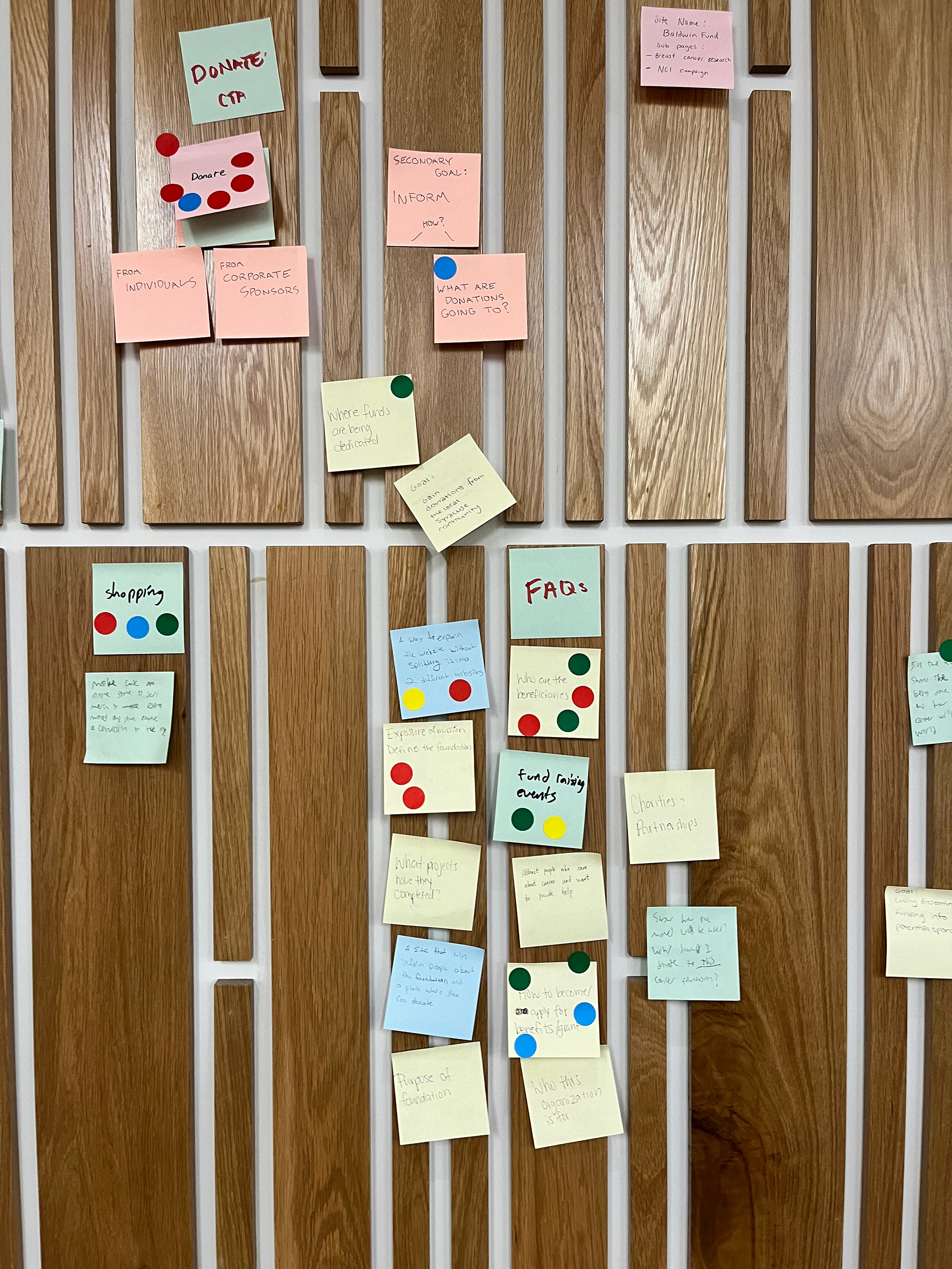
Because this redesign was a complete overhaul of the previous website, we took a completely fresh approach to its architecture and user flows. We started by using the old website and thinking about what worked and didn't work. In addition to this, we also brainstormed things the website should include/answer. This included writing down questions users would ask, pages they would want to find, etc. After we threw all these ideas against the wall, we had a discussion and grouped them into categories. From there we used stickers to vote which of these items is most important/necessary to its respective category. Some sticky notes got a lot of votes and some got none. These categories created the framework of the website.
From Lo to Hi
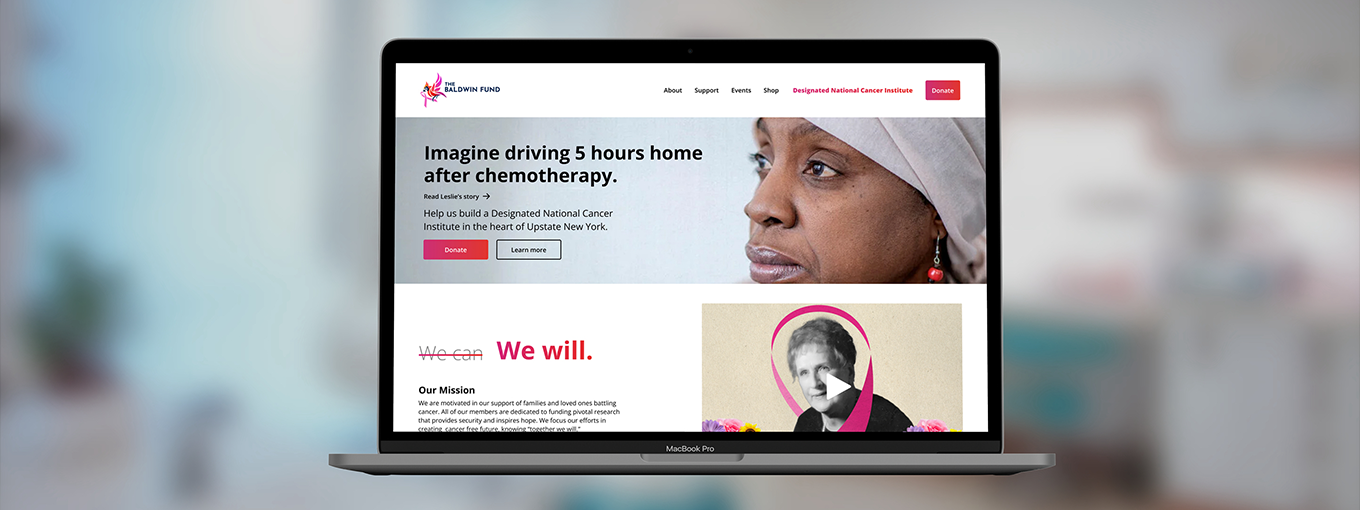
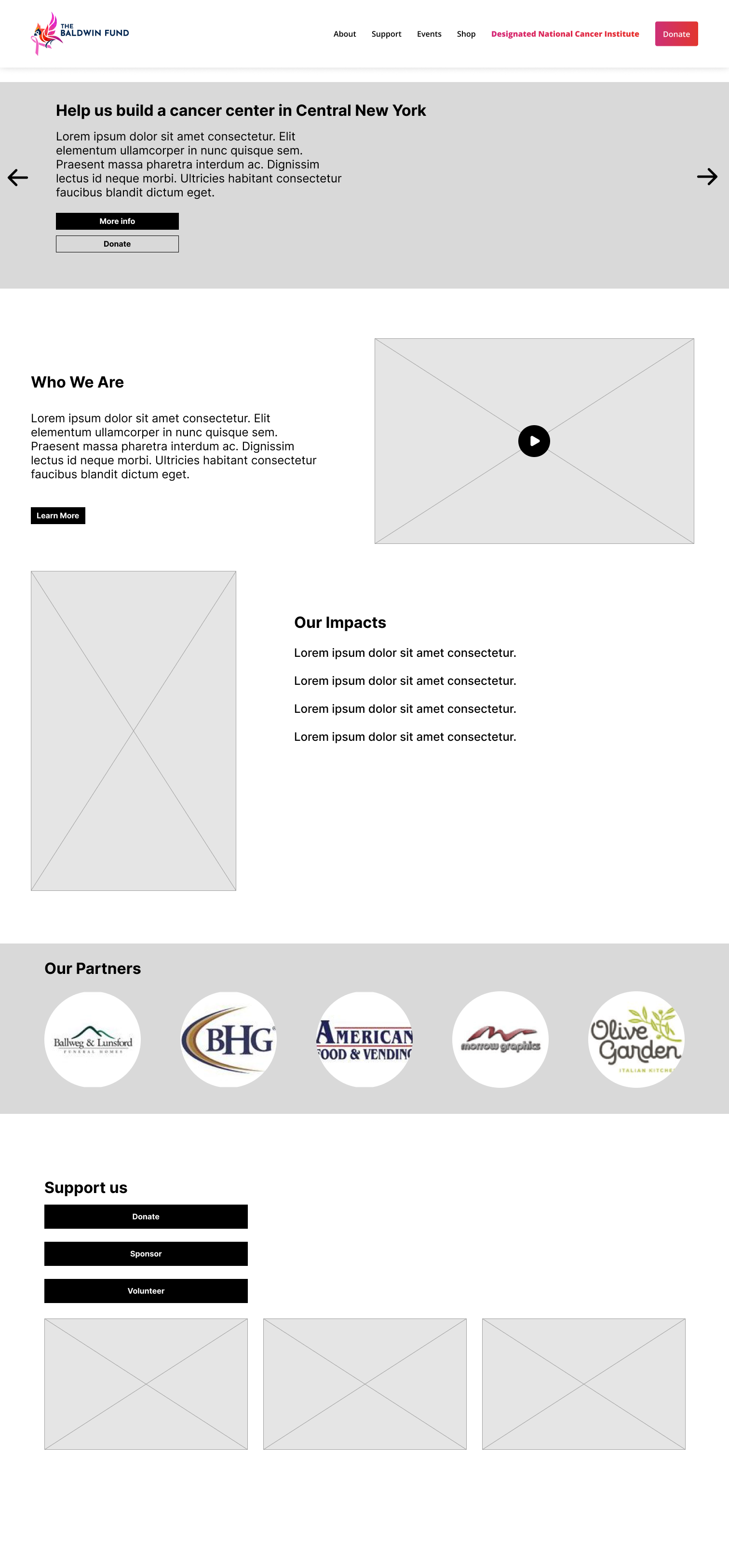
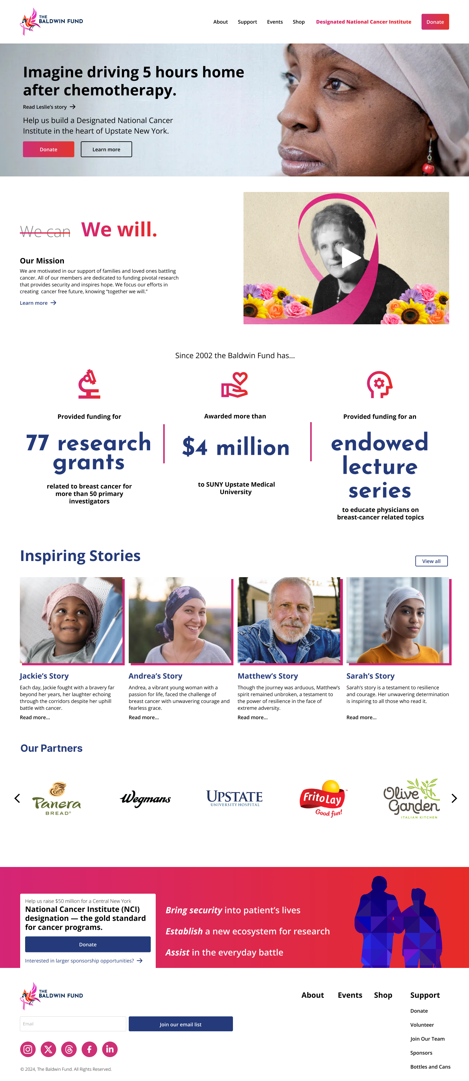
The homepage was designed to guide visitors toward donating by following a three-part sequence: engage, educate, and call to action. A main banner puts users in the shoes of local cancer patients to illustrate the impact of an NCI and appeal to their emotions, while a mission statement paired with an origin video builds understanding and credibility. Two high-contrast buttons then provide seamless access to the donations page. Given the two-day timeline for the entire project, we prioritized a mobile first approach, with the homepage being the only screen mocked up in both formats. The remaining screens designed in mobile only.
The homepage was designed to guide visitors toward donating by following a three-part sequence: engage, educate, and call to action. A main banner puts users in the shoes of local cancer patients to illustrate the impact of an NCI and appeal to their emotions, while a mission statement paired with an origin video builds understanding and credibility. Two high-contrast buttons then provide seamless access to the donations page. Given the two-day timeline for the entire project, we prioritized a mobile first approach, with the homepage being the only screen mocked up in both formats. The remaining screens designed in mobile only.
Additional Pages
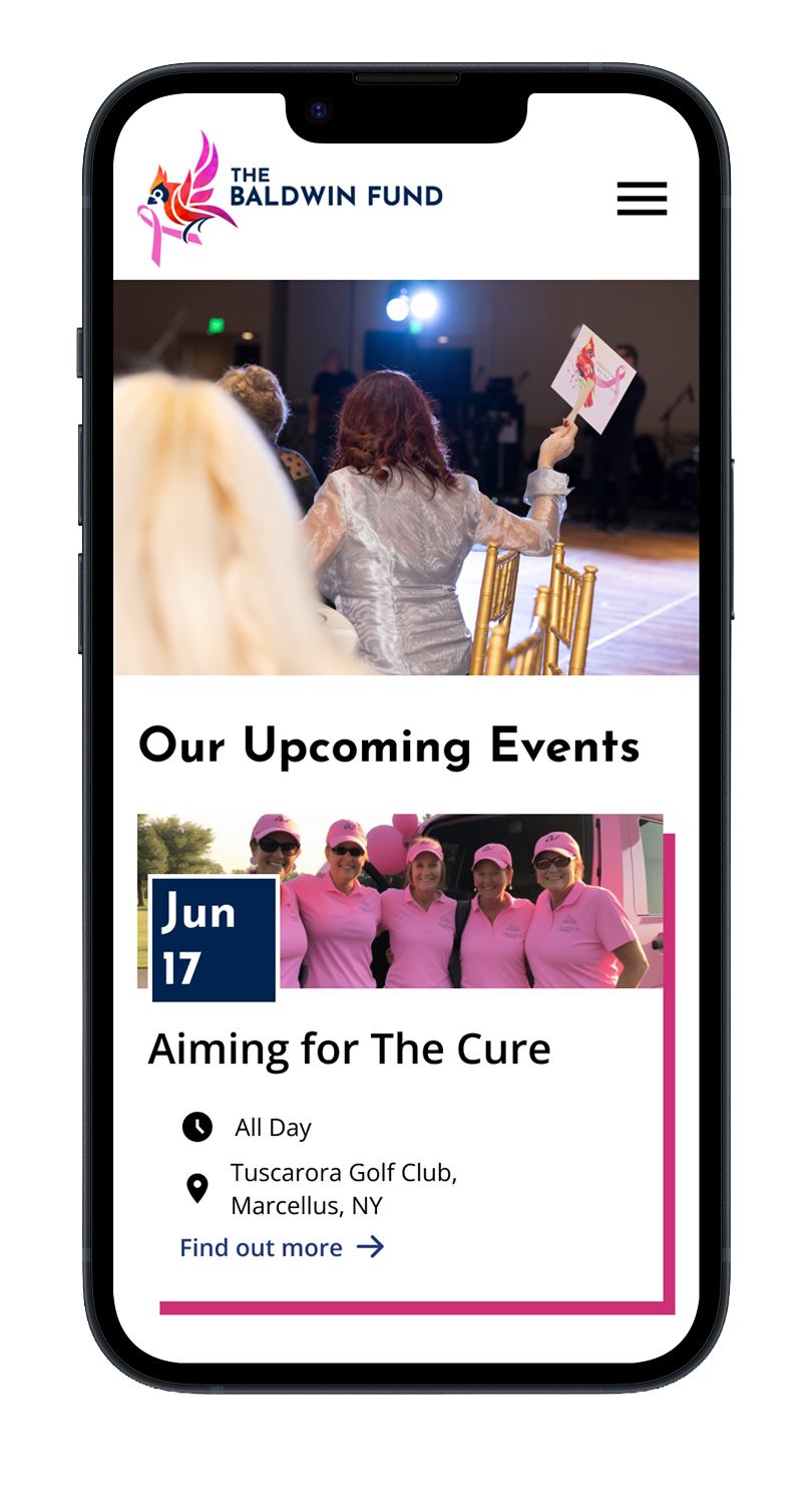 Events
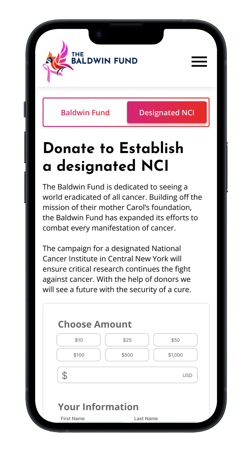 Donate
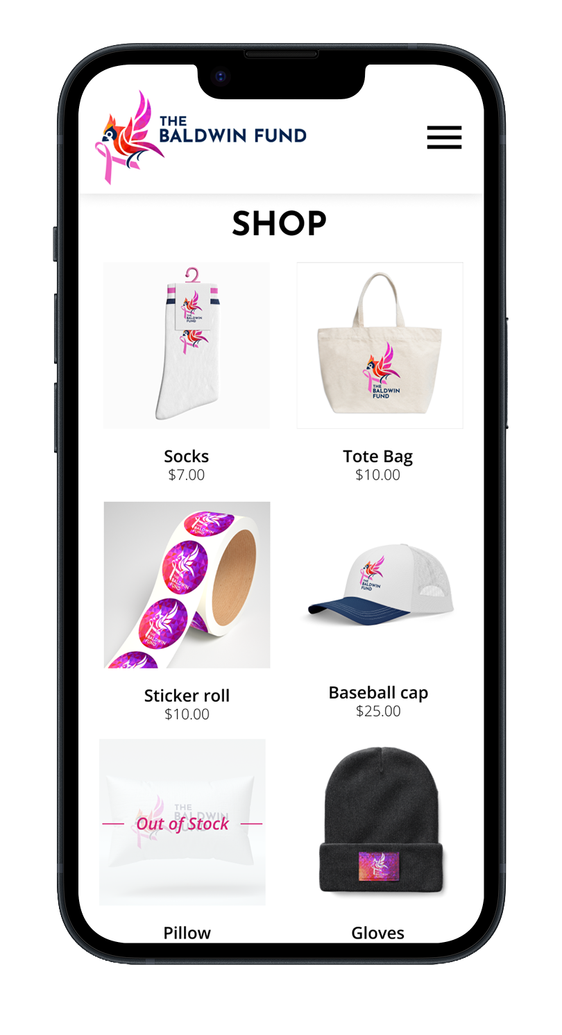 Shop
Shop
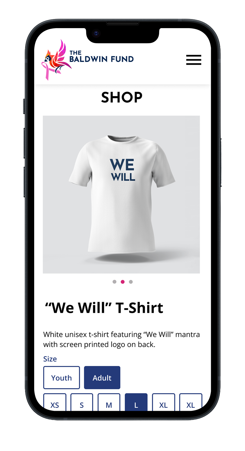 Product